Post contents
Dimensions are weird. While most web apps seem to focus on the x and y axis, representing a 2D plane that the user interacts with, there's actually a z-axis that's often ignored. Some browsers, such as Microsoft Edge, even provide a way to see a website blown up into a 3D view:
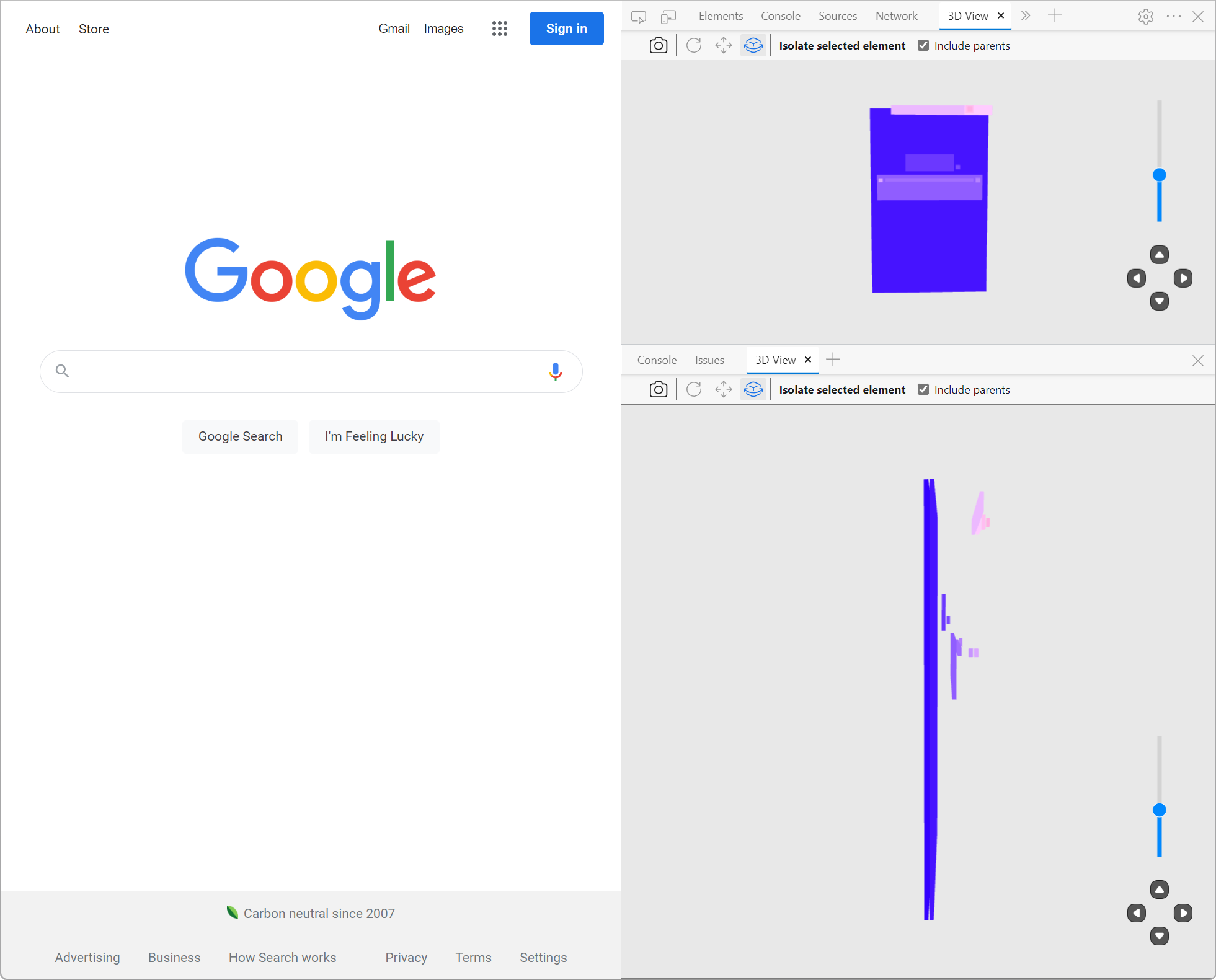
While this is cool, by introducing a third dimension to our web pages, we introduce the ability for elements to overlap with one another. Managing overlapping issues using CSS is tricky.
Sure, you have a z-index, which many claim is an easy way to manage an element's z axis, but it seems so brittle and inconsistent!
This article doesn't expect you to have pre-existing
z-indexknowledge. If you're being sent this article to learn howz-indexworks, you're in the right place.
For example, let's think about modals. Modals are UI elements that enable you to display information in a box that rests above the rest of your page's contents. This is what an example modal looks like from Google Drive:
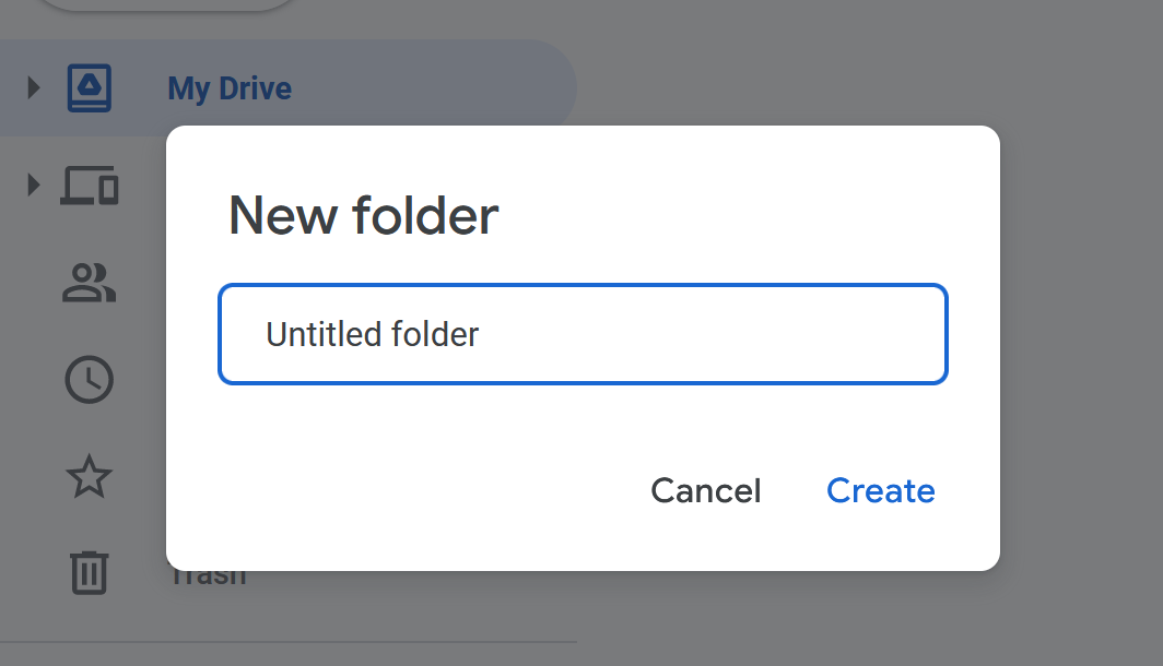
Despite some UX headaches that modals can introduce into an app, they're still a widely used UI element in many applications today. While building sufficiently useful modals can be a challenging task, a rudimentary modal can be completed even without JavaScript.
Let's use some CSS and HTML to build a basic modal:
<div> <div id="body"> <p>This is some text, pretend it's an app back here</p> </div> <div id="modal-container"> <div id="modal">This is a modal</div> </div></div><style>#modal-container { position: fixed; top: 0; left: 0; height: 100%; width: 100%; display: flex; justify-content: center; align-items: center; background: rgba(0, 0, 0, 0.5);}#modal { background: white; border: 1px solid black; padding: 1rem; border-radius: 1rem;}</style>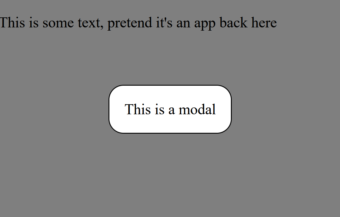
Tada! 🎉 Now we have a fairly basic modal to display whatever HTML we want inside.
But let's say that we keep building out the page. As we do, we might, for example, want to have a footer beneath our main page's content.
<div> <div id="body" style="min-height: 50vh"> <p>This is some text, pretend it's an app back here</p> </div> <div id="modal-container"> <div id="modal">This is a modal</div> </div> <footer style="min-height: 50vh">App Name</footer></div><style>#modal-container { position: fixed; top: 0; left: 0; height: 100%; width: 100%; display: flex; justify-content: center; align-items: center; background: rgba(0, 0, 0, 0.5);}#modal { background: white; border: 1px solid black; padding: 1rem; border-radius: 1rem;}footer { position: relative; background: lightblue; padding: 1rem;}</style>At first glance, this might look like it's been successful, but let's take a look at the rendered output:
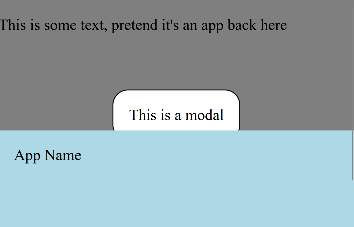
Oh dear! Why is the footer rendered above the modal?
Well, my friends, the modal is rendering under the footer due to something called "Painting Order".
What is painting order?
While the concept of the "painting order" in the DOM is quite complex, here's the gist of it:
Your browser is fed information from HTML and CSS to figure out what to show on-screen. While we often think of this process as instantaneous, nothing in computer science truly is.
This process of showing HTML and CSS on the screen is called "painting" or "drawing" the screen.
Painting contents on the screen might sound straightforward at first, but think about what that entails:
Given every bit of HTML and CSS, figure out where they belong and display them.
There are a lot of nuances there; Nuance that's dictated by a strict set of rules.
While we'll take a look into the specific rules of painting in a moment, let's start by taking a look at the following code example:
<div id="container"> <div id="blue">Blue</div> <div id="green">Green</div> <div id="purple">Purple</div></div><style>#container { display: relative;}#blue,#green,#purple { height: 100px; width: 100px; position: absolute; padding: 8px; color: white; border: 4px solid black; border-radius: 4px;}#blue { background: #0f2cbd; left: 50px; top: 50px;}#green { background: #007a70; left: 100px; top: 100px;}#purple { background: #5f00b2; left: 150px; top: 150px;}</style>Here, we have three different boxes that overlap with one another. Given that they overlap, which one do you think takes priority and, at least visually, is on top of the other boxes?
No, really, guess! Stop reading, take a look at the code, and take a guess. 😊
Ready to see the answer?
OK, here it is:
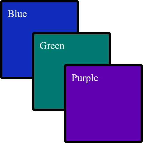
The reason these colored boxes are in the order they're in is thanks to their respective "paint order". The browser walked through its rules of "what order should I paint things in" and settled on this order.
While some CSS pros might assume that purple is seemingly on the top due to the order in which the CSS is laid out, just like other CSS rules, this isn't what's happening here.
Notice how the purple box seemingly remains on "top" when we re-arrange the CSS rules:
#purple { background: #5f00b2; left: 150px; top: 150px;}#green { background: #007a70; left: 100px; top: 100px;}#blue { background: #0f2cbd; left: 50px; top: 50px;}
If changing the CSS order doesn't re-arrange the boxes and change the paint order, then what does?
Well...
Re-arrange HTML Elements to Change the Painting Order
Let's take the HTML we had before and re-arrange it a bit:
<div id="container"> <div id="purple">Purple</div> <div id="green">Green</div> <div id="blue">Blue</div></div>Now, if we look at the box order, we'll see...
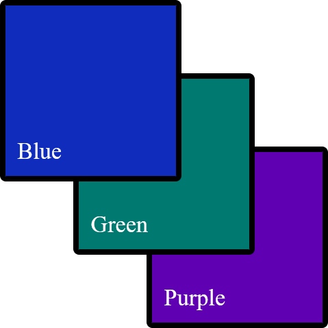
Now our boxes have reversed their height order! This is because one of the deciding factors of an element's painting order is its relationship to other elements.
Positioned Elements Behave Differently Than Non-Positioned Elements
This is where things get confusing. Take your time with this chapter; it's okay to have to re-read this section multiple times.
While we were using absolutely positioned elements for a simple demo before, let's take a step back and change our elements to be positioned using margin instead:
<div id="container"> <div id="purple">Purple</div> <div id="green">Green</div> <div id="blue">Blue</div></div><style>#container { display: relative;}#container > div:nth-child(1) { margin-top: 50px; margin-left: 50px;}#container > div:nth-child(2) { margin-top: -50px; margin-left: 100px;}#container > div:nth-child(3) { margin-top: -50px; margin-left: 150px;}#blue,#green,#purple { height: 100px; width: 100px; padding: 8px; color: white; border: 4px solid black; border-radius: 4px;}#blue { background: #0f2cbd;}#green { background: #007a70;}#purple { background: #5f00b2;}</style>Looks like a familiar output:

While working on styling, we wanted our green box to move to the left when you hover over it. This is straightforward enough to do using CSS animations; let's add it:
#green { background: #007a70; position: relative; left: 0px; transition: left 300ms ease-in-out;}#green:hover { left: 20px;}While our green button now smoothly moves left when you hover over it, there's a new problem: The green box is now on top of the purple and blue boxes.
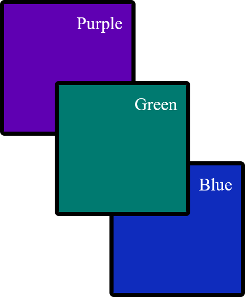
This is because browsers paint positioned elements before non-positioned elements. This means that our relative positioned element is painted first and seems to take priority in the z layer over non-positioned elements.
Understanding more rules of Painting Order
While relative positioning is one way that you can tell the browser to paint an element first, it's far from the only way to do so. Here's a list of CSS rules that will change the order an element paints in, from the lowest priority to the highest priority:
-
The
backgroundof the following tags:html,:root,body -
The
backgroundof the stacking context root elementCome back to this at the end of the article; it won't make sense now.
-
Positioned elements with a negative
z-index -
Non-positioned elements'
background -
Elements with a
floatstyle applied without apositionapplied -
Non-positioned
inlineelements -
The text contents of non-positioned, non-floating elements, as well as a few other rules
-
Positioned elements without a
z-indexapplied or with az-indexof0, as well as a few other rules -
Elements with a
z-indexof1or more -
Depending on your browser,
outlines
While this includes all of the steps of painting order according to the CSS specification, those steps may have more sub-steps. Overall, this list is non-comprehensive to keep the list readable.
So, if we have the following HTML:
<div class="container" style="background: rgba(0, 0, 0, 0.8)"> <div class="box slate" style="position: relative">Slate</div> <div class="box yellow" style="display: inline-block">Yellow</div> <div class="box lime" style="float: left">Lime</div> <div class="box green" style="">Green</div> <div class="box cyan" style="position: relative; z-index: -1">Cyan</div></div>We would see, from top to bottom:
- A
slatecolored box - A
yellowcolored box - A
limecolored box - A
greencolored box - The
container's background - A
cyancolored box

All of these rules are superseded by the order of the elements within the HTML, as we learned before. For example, with the following HTML:
<div class="container" style="background: rgba(0, 0, 0, 0.8)"> <div class="box slate" style="position: relative">Slate</div> <div class="box yellow" style="">Yellow</div> <div class="box lime" style="position: relative">Lime</div> <div class="box cyan" style="">Cyan</div></div>You would see the following order of elements:
- Lime
- Slate
- Cyan
- Yellow

This is because the lime and slate take painting priority over yellow and cyan thanks to their relative positioning, but are still in HTML order within the same z level priority and within the same stacking context.
Creating Stacking Contexts
"Welp, that's enough reading in the book today"
You think to yourself. You go lay down and get some sleep. In your dreams, you can still hear the book speaking to you:
[...] are still in HTML order within the same
zlevel priority and within the same stacking context
[...] within the same stacking context
The book repeats itself:
[...] within the same stacking context
You wake up, realize that you don't yet know what that sentence means, and think to yourself:
There's no way this gets even more complicated.
Unfortunately, it does.
At its heart, a stacking context is a group that you can move multiple items up or down the z-axis at the same time.
Take the following HTML:
<div class="container"> <div id="top-container" style="position: relative"> <div class="box slate" style="position: relative">Slate</div> <div class="box yellow" style="">Yellow</div> </div> <div id="bottom-container"> <div class="box lime" style="position: relative">Lime</div> <div class="box cyan" style="">Cyan</div> </div></div>What order do you think the boxes are going to be in?

The answer is:
- Slate
- Lime
- Cyan
- Yellow
This is because, despite the parent top-container having position: relative, the boxes are still within the same stacking context. This stacking context follows the same ordering rules as outlined before, which means that the positioned slate and lime boxes take z priority over cyan and yellow.
Ready for the twist?
Let's add z-index to our top-container:
<div class="container"> <div style="position: relative; z-index: 1"> <div class="box slate" style="position: relative">Slate</div> <div class="box yellow" style="">Yellow</div> </div> <div> <div class="box lime" style="position: relative">Lime</div> <div class="box cyan" style="">Cyan</div> </div></div>Now what order do you think they'll be in?

- Slate
- Yellow
- Lime
- Cyan
This is because, in reality, what we're ordering here is not the boxes. Instead, what we are ordering is the top-container and bottom-container divs, then the boxes, like so:
top-containerslateyellow
bottom-containerlimecyan
This only occurred when we added a z-index to top-container because that's when a new stacking context was created. When that context was created, we raised it to a higher z-axis due to the same ordering rules as before.
Remember, a stacking context is a grouping of elements that move together as a collection when the parent's
z-axis location is changed.
Stacking Contexts are created when:
-
z-indexis applied to a positioned element -
z-indexis applied to a child of agridorflexelement -
Element with an
opacityof less than1 -
Element with any of the following properties:
This list is non-exhaustive but contains most of the highlights of when a stacking context is created.
It's worth mentioning that if a stacking context is created, then the element that created said stacking context is treated with priority z axis ordering.
For example, if you have:
<div> <div style="position: absolute; top: 0; background: white">Absolute</div> <div style="opacity: 0.99; background: white">Opacity</div></div>Then it will show "Absolute" above "Opacity", thanks to the order of the HTML sequence; this is all despite positioned elements typically being prioritized above HTML sequencing.
If we remove the opacity: 0.99 from the "Opacity" div, then "Absolute" will be on top.
Another Modal Stacking Context Example
Let's take a look at what we've learned thus far.
We know from the previous section that position: relative and a z-index greater than 1 should create a stacking context.
Given this knowledge, what do we expect the following code to render?
<header class="container-box" style="position: relative; z-index: 1; background: #007a70"> Header</header><footer class="container-box" style="position: relative; z-index: 2; background: #0f2cbd"> Footer</footer><style>.container-box { color: white; padding: 1rem; border-radius: 0.5rem; border: 0.25rem solid black;}</style>No major surprises here; it renders a greenish rectangle positioned atop a blue rectangle with the text of "Header" and "Footer", respectively.
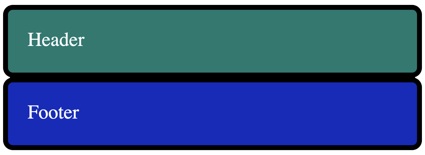
Now, let's say that we want to show a modal on top of the footer to show the user information they might think is relevant.
Now, what do you think happens if we add in said modal using position: absolute; z-index: 99 within the <header>?
<header class="container-box" style="position: relative; z-index: 1; background: #007a70"> Header <div id="modal" class="container-box" style=" position: absolute; z-index: 99; background: #007a70; width: 100%; box-sizing: border-box; bottom: -3.75rem; left: 0; " > Modal in header </div></header><footer class="container-box" style="position: relative; z-index: 2; background: #0f2cbd"> Footer</footer><style>.container-box { color: white; padding: 1rem; border-radius: 0.5rem; border: 0.25rem solid black;}</style>You might be surprised to find that nothing changes - it seemingly doesn't show the modal anywhere and instead shows the same two "Header" and "Footer" elements as before:

However, if we change the footer code to the following:
<footer class="container-box" style="position: relative; z-index: 0; background: #0f2cbd"> Footer</footer>The only thing we changed was
z-indexfrom1to0
Then suddenly, we see the modal above the Footer as expected:
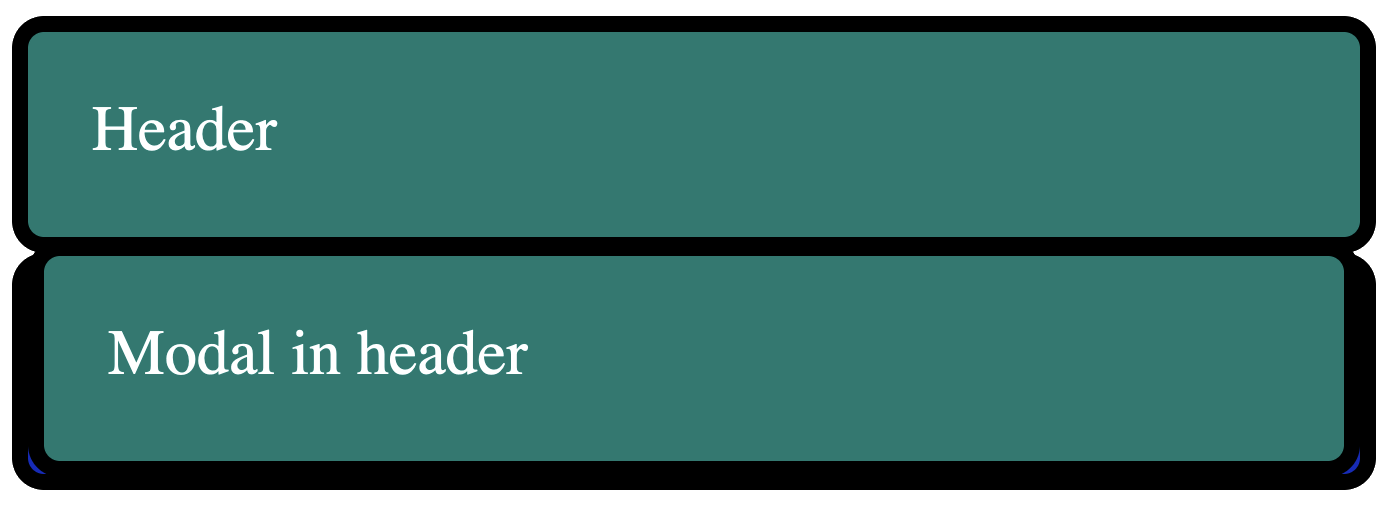
Why is this happening?
Well, this occurs because we create a stacking context inside of header when we do position: relative; z-index: 1. This, in turn, places the containing id="modal" div inside of the stacking context of header.
As a result, id="modal"'s z-index does not apply outside of the stacking context, and the group of elements under header is treated as z-index: 1 from the perspective of the footer.
Here's a diagram showing what I mean:
You'll see that both <header> and <div id="modal"> are both contained within a box that's labeled z-index: 1. This is because they're both contained within the header's stacking context.
Even though id="modal" has a z-index of 99, it's only applicable within the header stacking context, which means that it can never be placed above the footer element, which has a higher z-index of the header stacking context.
Stacking Stacking Contexts
Let's take the previous example to an extreme of sorts.
Let's say that we wanted our modal to have its own header that allowed you to scroll through the contents of the modal while the header stayed at the top.
<header class="container-box" style="position: relative; z-index: 1; background: #007a70"> Header <div id="modal" class="container-box" style=" position: absolute; z-index: 99; background: #007a70; width: 100%; box-sizing: border-box; top: 50%; left: 0; overflow: auto; height: 10rem; padding: 0; " > <div style=" background: #B92015; position: sticky; z-index: 10; top: 0; left: 0; width: 100%; padding: 1rem; box-sizing: border-box; " id="modal-title" > Modal Title </div> <div style="padding: 1rem; height: 10rem" id="modal-body">Modal in header</div> </div></header><footer class="container-box" style="position: relative; z-index: 2; background: #0f2cbd"> Footer</footer>At first, it might look a bit odd since the footer is on top of the modal (for the reasons we outlined before).
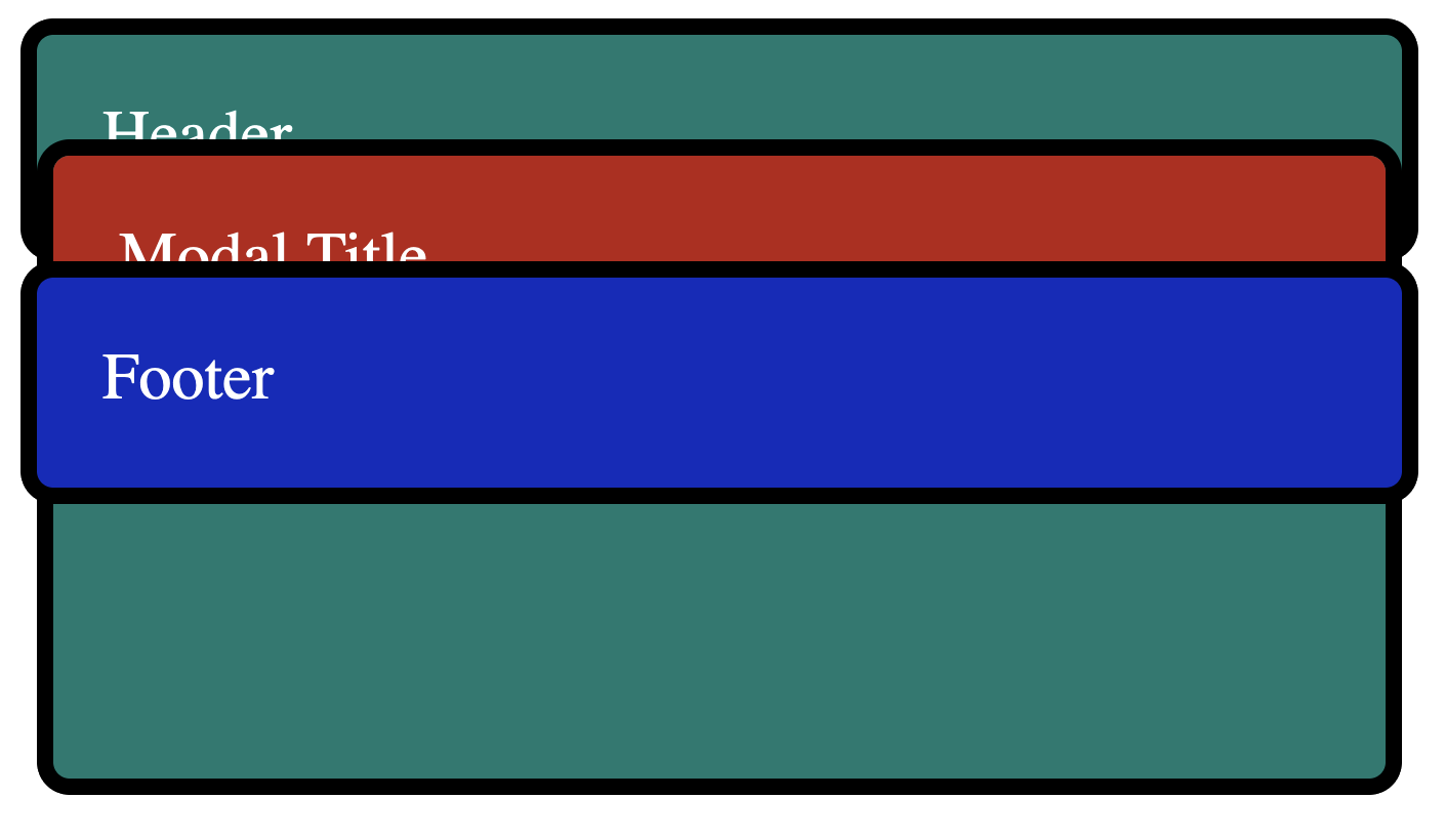
However, if we remove the footer temporarily, we can see a modal rendering on top of the header as expected:
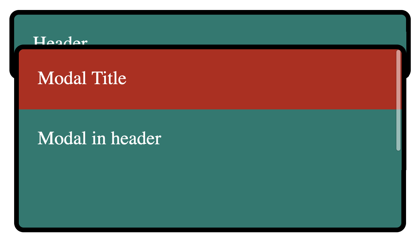
You might be wondering:
Why isn't the modal header above the footer? After all, a
z-indexof10should beat az-indexof 2.
This is again because of stacking contexts being created. In this case, not only does header create a stacking context, but id="modal" does as well! Because modal-header is inside of the modal stacking context, and modal is inside the header stacking context, it's still below the footer.
We can see what these stacking contexts look like here:
That's right; You can contain stacking contexts within other stacking contexts. 🤯
The Problem with Stacking Contexts
So what's the problem here? If you control the HTML, you can simply move the
modalout of theheaderand place it afterfooter. That'll make it overlap the footer and everything before, so long as it doesn't have a higherz-index, right?
Well, that's true...
AHA!
... with a major caveat.
In modern web development, it can be easier said than done to control exactly where HTML elements render.
In particular, if you use a framework such as React, Angular, or Vue, your components might look something like this:
<Header/><Footer/>Where Header is a component with the following:
- React
- Angular
- Vue
const Header = () => { const [isDialogOpen, setDialogOpen] = useState(false); return <> <button onClick={() => setDialogOpen(true)}>Open dialog</button> {isDialogOpen && <Dialog/>} </>}In this instance, without moving the state out of dialog, how would you render the contents of Dialog after the Footer component?
The answer? JavaScript Portals.
React has createPortal, Angular has the CDK Portal API, and Vue has their <Teleport> component.
Want to learn more about how React, Angular, and Vue solve this problem? Check out my upcoming book called "The Framework Field Guide", which teaches all three frameworks at the same time; Portals included.
Want to learn more about the "stacking context", I'd suggest reading through the following resources: